


II. Data▲
As discussed, I will use here the example of the EU Parliament, as of May 2023. You can easily transpose the method to any other political assembly, as long as it is organized along a left-right axis.
The elected representatives are called Members of the European Parliament (MEPs). They have been elected in May 2019, and will be renewed in June 2024. The EU Parliament has two hemicycle buildings, in Strasbourg for plenary sessions, in Brussels for additional sessions.
II-A. Data source and inspirations▲
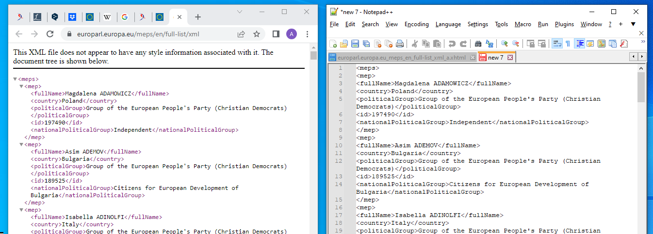
The website of the EU Parliament includes a ‘MEPs’ section, with the Full list downloadable in XML format. An actual download results in a .xhtml file, crammed with useless HTML and CSS formatting code, but copy-pasting the XML content into a text file produces a clean XML file.
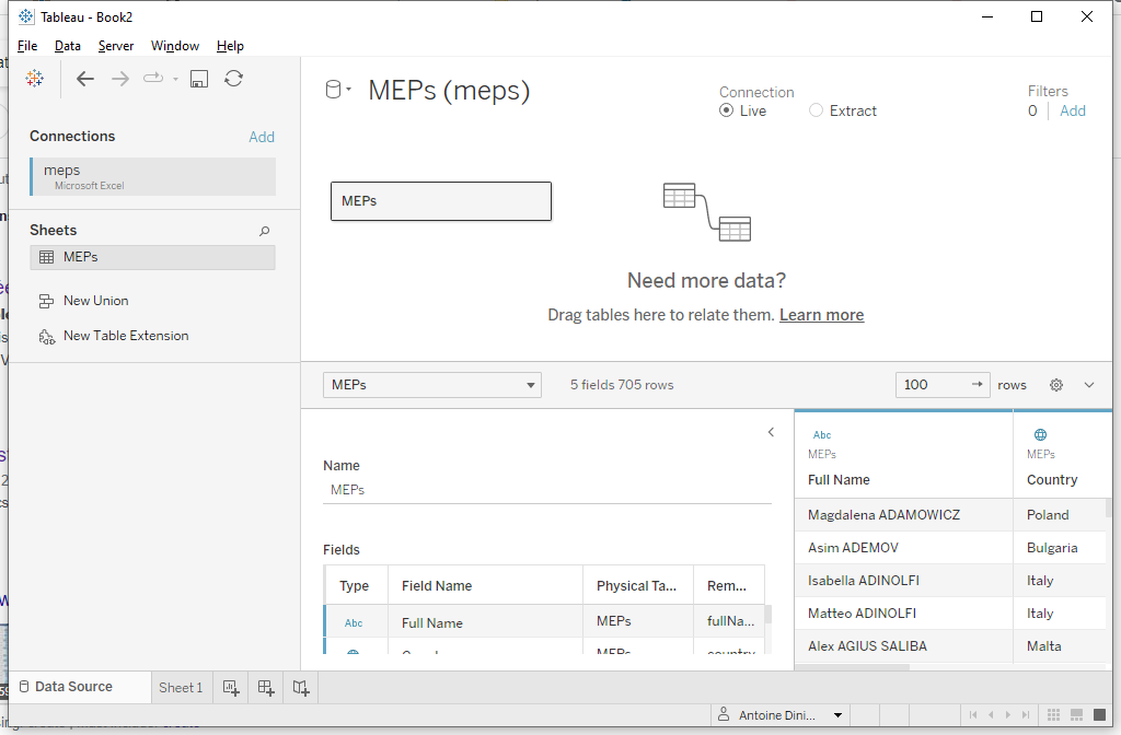
Surprisingly, Tableau lacks a connector for XML data. Excel has, and if you are not on speaking terms with Microsoft, you can easily find free online toolsConvertCSV.com to convert and XML file to CSV.
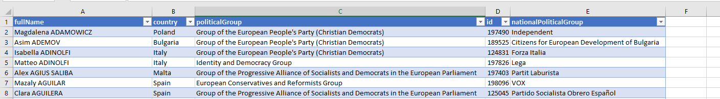
This data source includes all that we need:
- granularity at seat-level, i.e. each row represents a MEP
- a unique numeric ID
- the political group for each MEP
Googling for EU hemicycles reveals seating plans for both locations, Strasbourg and Brussels. This will help us to objectify the political position of each group.
II-B. Filler data▲
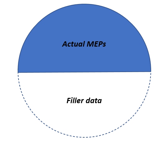
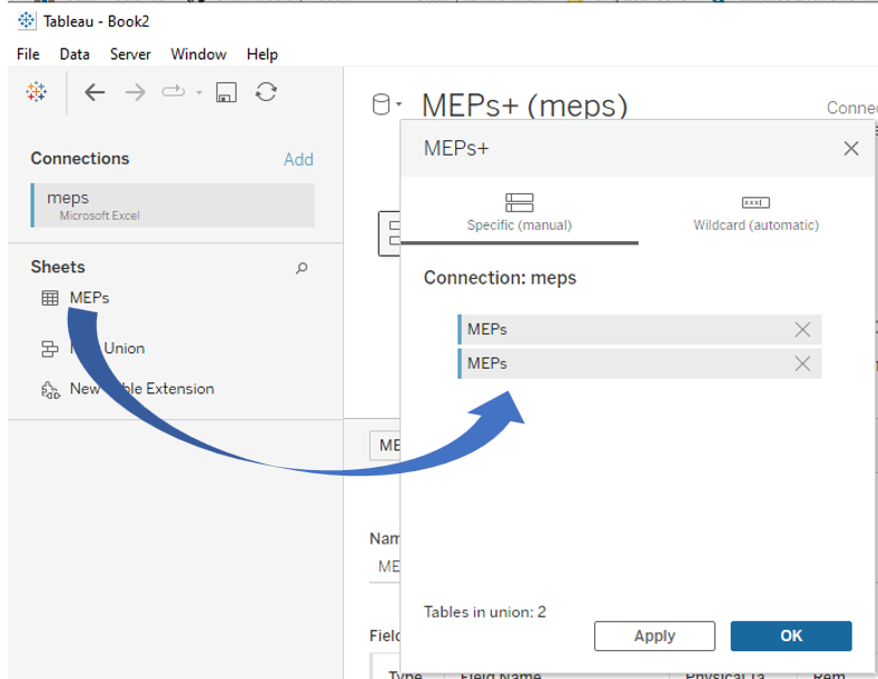
We aim to use a pie chart, but with all useful data in the upper half of the pie, in order to get a hemicycle. To do so, we need filler data with exactly the same number of rows, to occupy the lower half-pie.
II-B-1. Exercise: add fictitious data**▲
We could use Excel or any other tool to edit the data file and add fictitious rows, but there is a Tableau feature to do this in an easier way and to avoid editing the source file. Can you guess which one?
II-B-2. Answer▲
II-C. First pie chart▲
Let us stay on this worksheet to begin with the pie.
II-C-1. Exercise: create the formula for the political group*▲
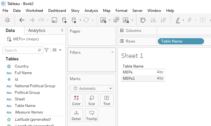
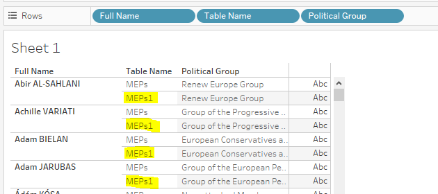
The actual MEPs (by convention, we will consider they are those coming from the first instance of the data file)) have to stay in their political group, while data from the second instance should form a filler group (we can call it the ‘white group’, as its pie share will be displayed white-on-white). Can you create a calculated field called Group to implement this rule? It is trivial if you are experienced enough with the Tableau formula language, but you could need some research if you are not.
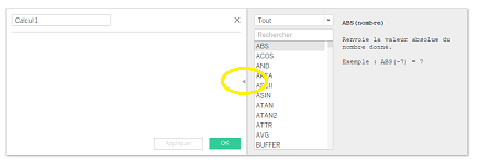
If you have never created a calculated field, just go to the Analysis menu and select Create Calculated Field; you can also right-click any field in the Data Pane, or even on the blank background in this pane. A window shows, where you have to fill in the field name and the formula to use; at the right of this windows, a gray pane displays the available functions with examples of syntax. A small black triangle will show or hide this pane.
II-C-2. Answer▲
II-C-3. Setting up▲
First, let us test our formula; drag our Group field on the Rows shelf of a new sheet. As each MEP is on one data row, we can use the rows counter generated by Tableau as the count of MEPs. As our dataset is called MEPs, this counter is called MEPs (Count).
Just drag the counter to the Text tool to get the headcount per group, and use the Show-Me to turn this table into a pie chart.
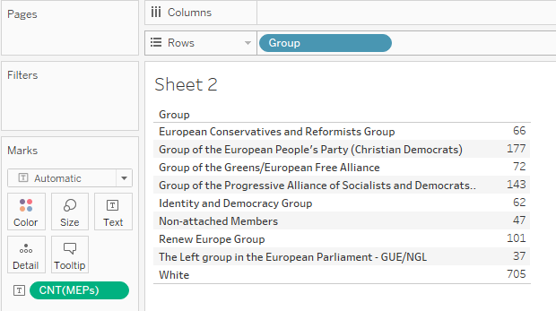
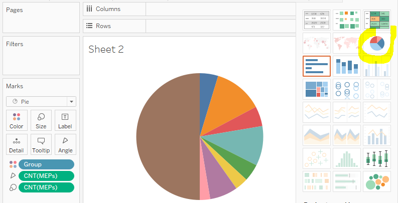
Our filler group is playing its part perfectly; yet, we still have some work to do before getting a proper hemicycle…