

IV. Labels for the groups▲
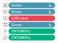
The main use for a Parliamentary chart is representing the majority or finding alternate majorities. Our chart is not very convenient for this, as it does not display any figure. Let us try to add the Group and MEPs (Count) fields on Label.
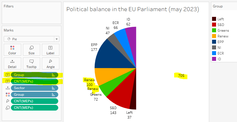
We now have our labels, that has provoked a series of issues, from the most trivial to the most complex:
- as the Sector pill is not the first one anymore, we have lost the sort order; of course, we just have to drag it in first position again
- some labels may be missing; just click on the Label tool and check Allow labels to overlap other marks
- the label with the number of MEPs in the white group does show, betraying the presence of fillers; a little IF would be enough to remplace it with a NULL (we will fix this later)
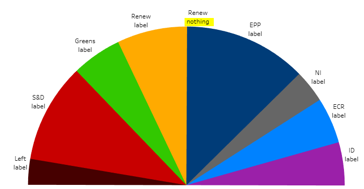
- the central group, Renew, has two labels, the one with 100 MEPs and the other with 1; this is where the real difficulties begin
The grain level of our chart is Sector, so technically it is normal there is a label per sector rather than per group, but that’s quite unfortunate. Instead of two labels with 100 and 1 MEPs, we want one with 101 MEPs, and it has to be placed on the side with the most MEPs.
There are two policies for this, either LODs or Table Calculations. You can test whichever you prefer, or even try both. In any case, I invite you to Duplicate your current sheet, so you can test various versions and without breaking anything.
Another improvement would be coloring the label like its group; to do this, click the Label tool, then Font, and check Match Mark Color. As an extra perk, the label for the white group becomes white on white. I have not kept this option, as we will have to use formulas to fix the double label of the central group, but you can perfectly use it.
IV-A. With LODs▲
Our chart includes two dimensions, Group and Sector, with a hierarchy relationship between them (a sector belongs to one group, a group can include two sectors). Hence, Tableau can perform calculations on three different levels:
- the detailed data level, i.e. MEP-level
- the grain level of the chart, i.e. sector-level
- the group level, which determines color
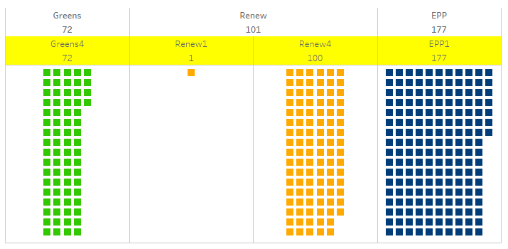
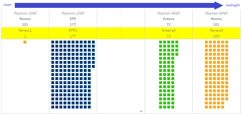
Here is a sketch of the data at these three levels for Renew and (for comparison), for both neighboring groups, Greens and EPP:
Our labels are at the chart grain level (Sector), we will use LODs to get data at the upper level (more aggregated) and at the lower level (more detailed).
IV-A-1. Exercise: compute the headcount at group-level**▲
Create a new calculated field, LOD Label, to get the count of MEPs at group-level, then use it in the labels instead of COUNT(MEPs).
IV-A-2. Answer▲
IV-A-3. Exercise: get the headcount of the majority sector***▲
Now, update your formula to get the headcount of the bigger sector in the group. On my sketch above, your formula should do this:
IV-A-4. Answer▲
IV-A-5. Exercise: compare headcounts***▲
Now, edit the formula to display the word ‘label’ if the sector headcount matches the headcount of the bigger sector in group, and else the word ‘nothing’.
IV-A-6. Answer▲
IV-A-7. Exercise: compute the text for labels**▲
Now, remove any other field from Label, and finalize the LOD label formula that will display the name and the headcount once for each group, except the white group.
IV-A-8. Answer▲
IV-B. With Table Calculations▲
In a relational database, tables store data rows with no specific order; according to the customary analogy, records are in their table like marbles in a bag. With LODs, we stayed within the boundaries of this logic and we built our formulas by matching data on different levels of aggregation.
Tableau proposes an alternate mechanism, calculating from data already displayed on the chart. With this approach, the sort order of the viz can be used to implement notions like ‘previous data’, ‘next data’, ‘first row’, ‘last row’, and so on. This mechanism bears the weird name of Table Calculation – the said ‘table’ does not refer to tables on the data source, but to the data set underlying the chart. Probably you have already used or met this system? Tableau represents it by displaying a delta (Δ) on the pills using it.
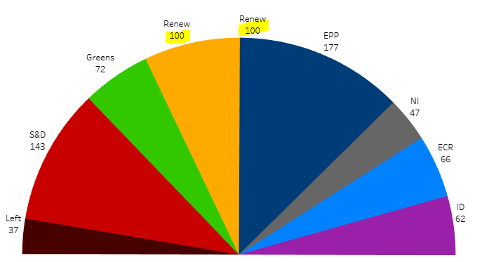
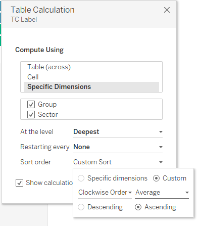
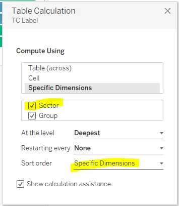
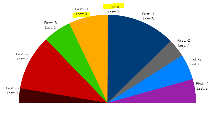
Now, please have a backward look at the hemicycle as it was at the beginning of this section, i.e. with the two labels 100 and 1 for the Renew group. The sectors are ordered along the Clockwise Order field, from center-right to center-left via far right, fillers and far left.
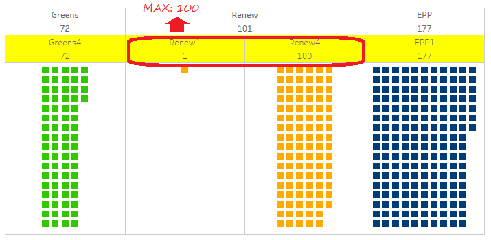
By construction, the duplicate label is on the central group (the one split by the median). Hence, the two sectors concerned are necessarily the first and the last clockwise. Here is a new version of my sketch with the three levels of data (MEP, Sector and Group) for the Renew group and its neighbors, reorganized to follow the clockwise order.
When can now think in terms of positions:
- we have to hide either the first or the last label (the one with the smaller headcount)
- the non-hidden one should display the total headcount of both
- the label for white group should also be masked
- the other labels should display normally
This way of telling it is simpler and more intuitive than the one with LODs, because everything is expressed at the sector level (grain level of the chart). In practical terms however, implementing it is not totally obvious…
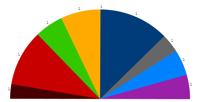
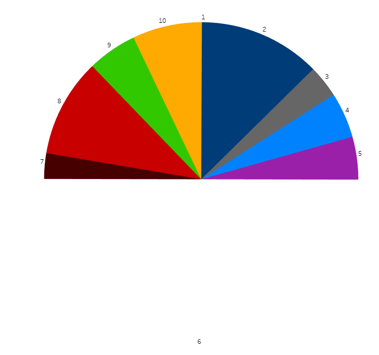
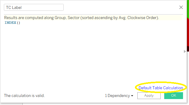
Everything relies upon our capacity to tell the first and last sectors apart from others, so let us start by trying to display their order index. Create a new calculated field, TC Label, with just INDEX() as a formula. This function returns the order of items on the chart. Drag this field to Label, you should get this result (a bit disappointing):
IV-B-1. Exercise: set the Table Calculation OK***▲
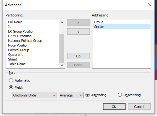
Now, click the Δ symbol on the TC Label pill, choose Edit Table Calculation, and torture it until the sectors are numbered 1 to 10 clockwise.
IV-B-2. Answer▲
IV-B-3. Exercise: test first and last positions*▲
The function to get values from another sector is LOOKUP, it relies on two other functions, FIRST and LAST. Both these latter functions (to use with no argument), return the gap between the current label and the first or last one… maybe that’s not very easy to figure out? Edit the calculated field to display the result of FIRST and LAST on each sector.
IV-B-4. Answer▲
IV-B-5. Exercise: get the last value*▲
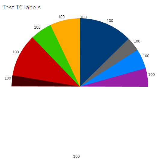
We will now test the LOOKUP function. Edit the calculated field so that the headcount of the last sector (100) displays on all labels, like below:
IV-B-6. Answer▲
IV-B-7. Exercise: compute label text**▲
You now have all the parts, you just have to devise the eventual formula for labels.
If you have read the ‘With LODs’ section above, you should be able to solve the ‘cannot mix aggregate and non-aggregate’ errors. If not, I invite you to view this bit.
IV-B-8. Answer▲
IV-B-9. Finishing▲
You can now hide the color legend, as it is redundant with the labels.
As you can see on this example, the difficult part is to get the right setting for the Table Calculation. Once you have got it, the syntax is simpler and more direct than the one for LODs.
V. Add percentages for arcs▲
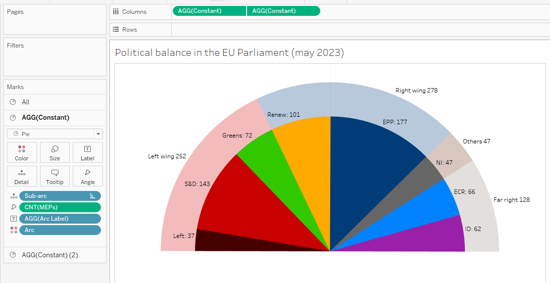
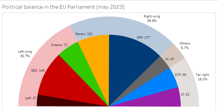
We have set up a hemicycle and display the headcount for each group, in other words we now represent correctly the raw data. Now, we will enrich the chart with two features that are a matter of political analysis: the political balance between bigger political tendencies (e.g. left wing vs right wing vs far right), and the percentages for these big blocks.
V-A. A second semicircle for arcs▲
Beyond the political weight of each political group, we would like to display insights about the political balance in a parliament. In most national chambers we would display the government’s majority versus opposition(s), but the EU is a bit different, as there is no established majority and the Commission comes from national governments, not the EU Parliament. As there are no formal alliances between groups, I would rather avoid the terms ‘coalition’ or ‘block’, and I will use the geometric concept of ‘arc’, which does not assume any agreement between its items, but just implies they are adjacent on the left-right axis.
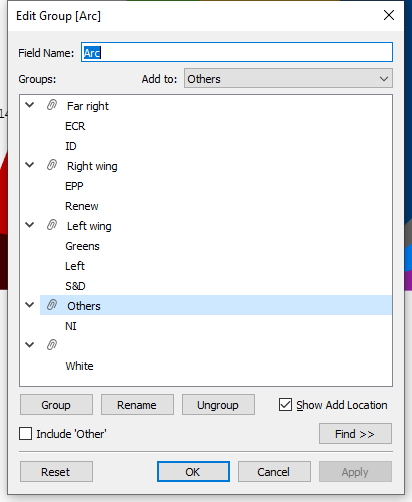
I will propose you the following breakdown:
- a first arc for the left wing, from The Left to Greens
- a second arc for the (center and) right wing, Renew and EPP
- a third arc for the nationalist or far right groups, ECR and ID
- a residual arc for ‘others’, i.e. the NI group
- and a technical arc for the white group
If your political categories diverge from mine, please feel free to organize your arcs in another way, with no consequence for the rest of this case study.
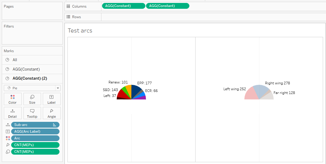
We will display these arcs on a second pie, and we will superimpose this second pie with the first one. As with groups, Tableau forces us to begin at the top middle position, so we will have to split the central arc (actually, the second one) into two sub-arcs (the first one on the right side, with the sectors Renew1 and EPP1, and the second one on the left side, with just Renew4).
V-A-1. Exercise: create arcs and sub-arcs*▲
Implement both these fields, arcs and sub-arcs, with the technically simplest method.
V-A-2. Answer▲
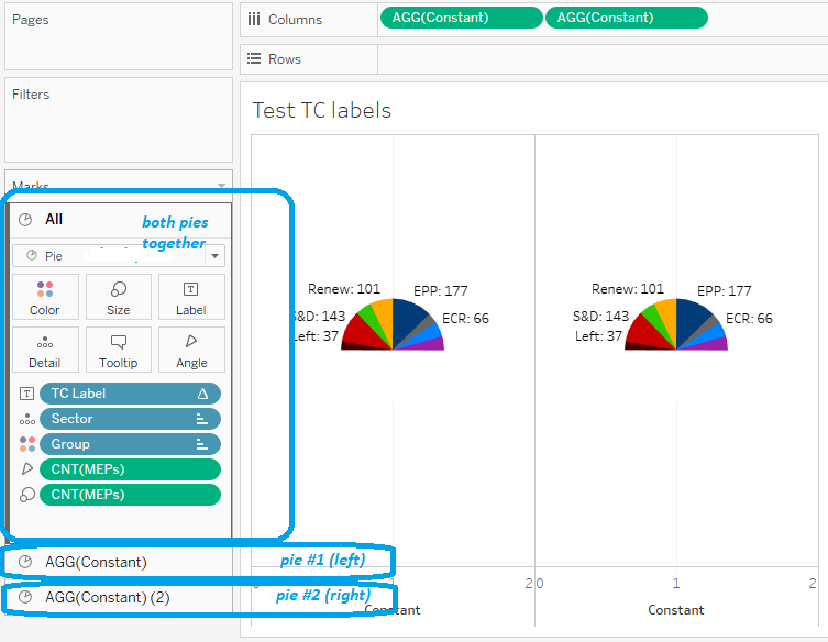
V-A-3. Exercise: duplicate the pie to prepare superimposing***▲
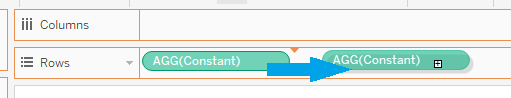
We now want two identical pies, next to each other on the same worksheet. If you already know the trick for this, your deserve your three stars and you can go directly to the answer. If you do not, I will try to make you guess, but I have to confess this is rather convoluted.
A regular Tableau pie chart does not use the Rows or Columns shelves. If you put a dimension on either shelf, you get a pie chart for each dimension value. For example, if we were working on the US Congress, with a ‘Chamber’ dimension to distinguish between Senate data and House of Representatives data, I could put this Chamber dimension on Columns to get a Senate pie next to a House of Representatives pie.
Our case is a bit different: first we do not have a relevant dimension, and moreover we will eventually superimpose both pies using Dual Axis, which can be used on measures only…
V-A-4. Answer▲
V-A-5. Exercise: display political arcs**▲
Now, edit the second pie so it displays arcs instead of groups. Make all adaptations necessary, and use dimmed colors.
V-A-6. Answer▲
V-A-7. Exercise: superimpose the pies**▲
We are now ready to superimpose both pies. Switch to Dual Axis, adjust the sizes so that the pie with arcs is slightly bigger than the one with groups, then put the small one over the big one.
V-A-8. Answer▲
V-B. Computing percentages▲
The underlying question in a Parliamentary Chart is always who can get an absolute majority, i.e. over 50% of seats. Experts in EU politics know that since the departure of UK MEPs, this is 353 votes, but of course displaying the headcounts of arcs as percentages would make things easier for everyone.
Probably you have already used the ‘Percent of Total’ table calculation to display pie shares in percents? Alas, we cannot use this because of the fillers, who make the total headcount twice as big as the real figure.
V-B-1. Exercise: setting up the ratio**▲
Create a new calculated field, % Arc.
- if your arc labels use LODs, get the headcount from the label formula, normally that is {FIXED [Arc]: COUNT([MEPs])}, then copy-paste it to the new calculated field and made a correct percentage out of it.
- if your arc labels use Table Calculations, do the same thing, but do not bother with white group nor Renew for the moment; your headcount should just be COUNT([MEPs])
whatever your case (LOD or TC), find two significantly different solutions for fixing the percentage calculation
V-B-2. Answer▲
V-B-3. Exercise: format into percentages**▲
The Arc label formula has the mechanic to display only the right labels, and the % Arc formula has the right figure. It should be easy to combine them, however there is an unexpected issue: Tableau has no function to format numbers into text (imagine C without sprintf, or Visual Basic without Format). You have to make do nonetheless.
V-B-4. Answer▲
VI. Overflowing the semicircle▲
Finally, let us consider the visual display, at once to improve aesthetics and to discover certain mechanisms and limits of Tableau.
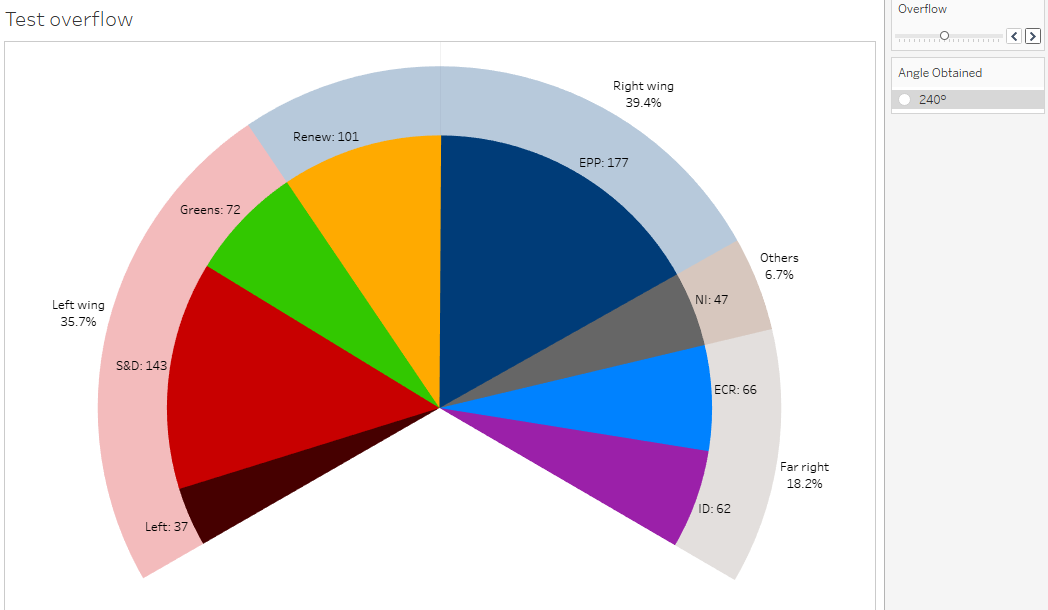
Up to now, we have based our works on a strict definition of the hemicycle as a semicircle, i.e. forming a circular arc with an angle of 180 degrees. But in real life, most assemblies (as well as parliamentary charts) go beyond this angle. As an example, the seating plan for Strasbourg displays an arc for MEPs of around 200°; with extra seats left and right for EU Council and EU Commission, the total arc looks close to 240°.

That should be simple enough in Tableau: we just have to create a parameter the user can use to choose the arc, and filter out the matching number of fillers. Hence, the point is how to transform a quantity into a selection. The first obvious solution would be to use Excel, Tableau Prep, or any other tool to add an incremental row number on the source file. Then, if you have to filter out 20 fillers, you will just have to filter on ‘Group different from white OR row# greater than 20’, and it will suppress the 20 first fillers. If you actually have to build up a Parliament chart overflowing beyond 180°, that would probably be the simplest solution.
As this article aims at exploring the possibilities of Tableau Desktop, I would like to discuss hereafter solutions with no other tool and without editing the data file. So, first, can we perform this numbering within Tableau Desktop?
The issue is that all functions for such a numbering (INDEX, RANK, RUNNING_COUNT, WINDOW_COUNT, etc.) rely on Table Calculation; as we want to number individual data rows, this Table Calculation should address the Id (or the Id / Table Name combination, or any other unique identifier, like the Full Name). As Table Calculations are performed on the data used in the chart, we would have to include the identifier in the chart (a priori on Detail), and the chart grain would go down to MEP-level. We would get a label per MEP instead of a label per sector, and we would have to review all our formulas to compute which ones should display or not among the potential 1,410 labels…
Although it is feasible (e.g. we could compute a median MEP in each group to position the label at mid-arc), it would be quite tedious, and we would not learn anything new about Tableau.
If you find a better idea, please propose it in comments!
I would like to propose you two different approaches; neither produces a perfect result, but they would probably be considered good enough in most projects, and they will lead us into new aspects of Tableau. Therefore, I invite you to duplicate your latter worksheet, so we can compare both results.
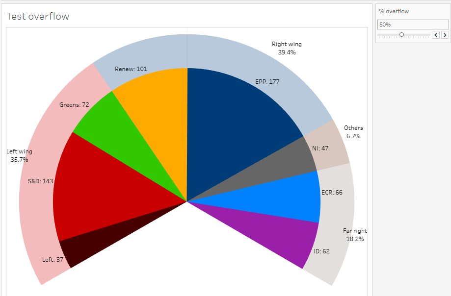
VI-A. With an overflowing percent▲
Our basic hemicycle has an angle of 180°, this is when there are as many fillers as MEPs. Maximum overflow would be an angle of 360°, i.e. a full pie, without any filler.
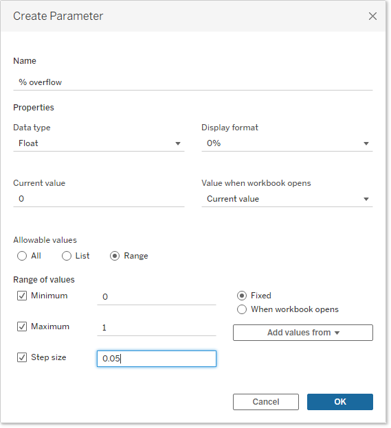
VI-A-1. Exercise: create the percentage of overflow*▲
Do what is necessary for making the user able to choose a percentage of overflow from 0% to 100%.
VI-A-2. Answer▲
VI-A-3. Exercise: create the flag▲
Create now a calculated field, ‘Overflow Flag’, returning a boolean result, that must be False for the right proportion of fillers; in other words, if the user chooses to overflow by 20%, your flag should remove 20% of the fillers.
VI-A-4. Answer▲
VI-A-5. Exercise: compute the angle from the percentage of overflow**▲
Define the formula to get the total angle according to Overflow %, then create a calculated field with it, Angle Obtained.
VI-A-6. Answer▲
VI-A-7. Exercise: display the calculated angle▲
On the parameter card, keep the slider but hide the percentage, then find a way to display the Angle Obtained just below the parameter card.
VI-A-8. Answer▲
VI-B. With Monte Carlo method▲
Now, let us do it the other way round: we want the user to choose his/her angle directly, and compute the proportion of fillers to filter out. As we cannot do this with a percentile, we will use a random selection!
You may find it surprising, but calculation algorithms based on random processes form a recognized method in statistics, under the funny nickname of Monte Carlo method. They are notably used in fluid mechanics or particle physics. In the archetypal example, you assess the area of a pond by randomly firing cannon balls within a land square including the pond: if you drown one ball out of three, then the pond area should be approximately one third of the land square!
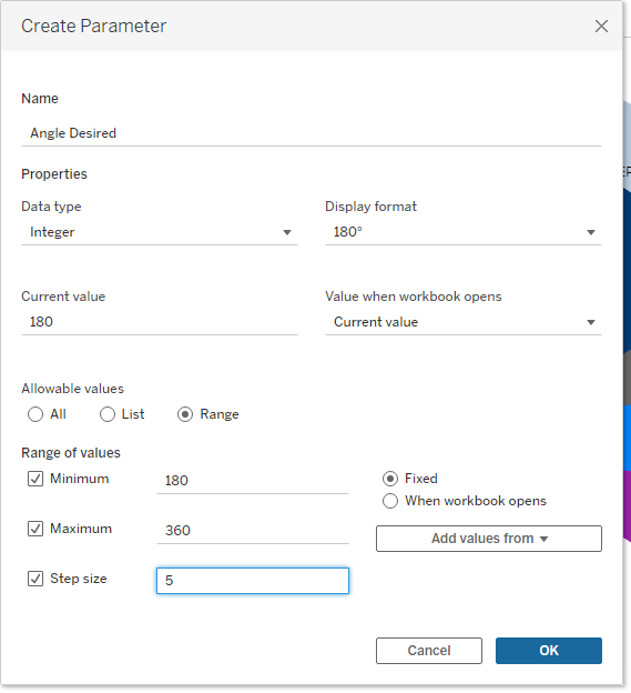
VI-B-1. Exercise: create the new parameter*▲
Create a new parameter, Angle Desired, and set the necessary options.
VI-B-2. Answer▲
VI-B-3. Exercise: compute the proportion of fillers to remove*▲
On paper, define the formula to determine the percentage of fillers to filter out according to the angle chosen by the user. Then, in Tableau, implement it as a calculated field, Exclude %.
VI-B-4. Answer▲
VI-B-5. Exercise: filter randomly*▲
We can now compute how many fillers should be filtered out. As we cannot select them with a percentile, we will choose them randomly. This exercise could have been ‘find a way to draw lots in Tableau’, but that would be quite unfair, as the answer is secret, or more precisely undocumented: the RANDOM function, to be used without argument. It returns a random decimal number between zero and one.
I can now fairly ask you: create a calculated field, Monte Carlo Filter, returning False for the proportion of fillers to remove, True for the proportion of fillers to keep, and of course True also for reals MEPs.
VI-B-6. Answer▲
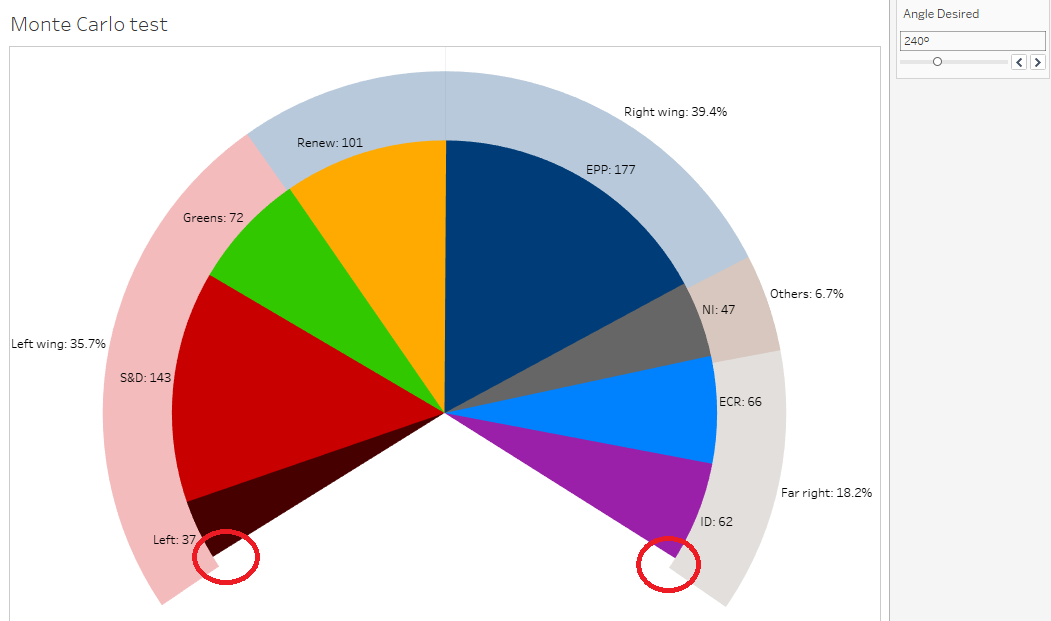
VI-B-7. Exercise: assemble the pieces*▲
Now you have all the elements. Go back to the worksheet you had duplicated before using percentiles, and make sure users can choose their angle and get the wished viz.
VI-B-8. Answer▲
VII. Conclusion▲
We used but one chart type, notoriously the simplest one, yet technical challenges were there. I myself can hardly believe I had to spend 68,000 characters to explain how to build up a half-pie! As a conclusion, here are the features we have used during this practical case:
- Union query
- row counter
- calculated field
- conditional syntaxes IF and CASE
- sort order formula
- dimension versus measures
- discrete versus continuous
- default properties (default aggregation, default number format)
- NULLs propagation
- median, percentile
- LOD expression
- sorting priority
- alias
- attribute, ATTR function
- Table Calculation
- addressing versus partitioning
- INDEX, FIRST, LAST and LOOKUP functions
- group
- Dual Axis
- double pie
- parameter
- filter formula
- RANDOM function
I hope you have found this practical case interesting and entertaining. If you have a competitive mind, this case include 34 exercises for a total of 58 stars. Count your points, then you are welcome flaunting your score in the comments.